Wikipedia:Graphics Lab/Illustration workshop: Difference between revisions
Gatto bianco (talk | contribs) Tag: Reverted |
No edit summary |
||
| Line 187: | Line 187: | ||
== SVG flag == |
== SVG flag == |
||
<gallery> |
|||
Escudo de Laukiz.svg|SVG coa |
|||
Laukiz bandera.gif|GIF flag |
|||
Flag of Laukiz.svg|New SVG flag |
|||
</gallery> |
|||
;Article(s): |
;Article(s): |
||
: [[:it:Laukiz]] |
: [[:it:Laukiz]] |
||
Revision as of 11:23, 20 January 2021
The Graphics Lab is a project to improve the graphical content of the Wikimedia projects. Requests for image improvements can be added to the workshop pages: Illustrations, Photographs and Maps. For questions or suggestions one can use the talk pages: Talk:Graphics Lab, Talk:Illustrations, Talk:Photographs and Talk:Maps.
This specific page is the requests page for the illustration workshop. Anyone can make a request for an illustration to be improved or created for a Wikipedia article. Clicking the "New Request" button will bring you to a standard template for submitting requests, as well as general advice that should be followed.
| Advice to requesters |
|---|
|
All requests:
SVG requests:
|
|
Requests from recent years:
| |
| For graphists: |
| If you have completed work and not received a reply you may use the {{GL Illustration reply}} template to inform the requester. |
| Graphists and other visitors to the Graphic Lab may be interested in the RSS feed of changes to this page. You may find it here. |
Good article and featured article topicon redesign
-
Current good article icon
-
Current featured content icon
- Article(s)
- 5,859 featured articles
- 3,696 featured lists
- 32,507 good articles
- Assorted additional talk, help, and process pages
- Request
- Yes, this one is a big one.
- Background: The current symbols for good articles and featured content have been used since those systems were introduced way back in Wikipedia's early days. They have significant problems. The featured article icon is too skeuomorphic, giving it an outdated look, and its excessive detail causes it to render poorly at small scale. The good article icon, meanwhile, has been adopted throughout the rest of Wikimedia (and in some places on Wikipedia) as the "support vote" icon, leading to conflicting usage. Far worse than the issues with them individually, however, is the fact that there is no shared visual language between them (the GA icon uses the norro style, and the FA icon does not use any style). When compounded by their overall lack of prominence (a separate issue that we're trying to address), this has led to the unfortunate situation where many (perhaps most) non-editing readers could not tell you whether a star or a green badge is a higher distinction. Given how much effort we put into the GA/FA systems, there's more than a bit of tragic irony to that.
- Process: This is the first stage in the process of redesigning the icons (after informal discussions in various places). Ideally, several proposals will be put forth that can be compared against the status quo in a more formal and widely-advertised round of !voting (similar to the process for the MediaWiki logo redesign), with the winner adopted.
- Design details: The redesigned icons could end up being anything from checkmarks (a la the Twitter verification badge) to a silver star for GAs to a multi-star system that begins with one star for stubs and increases thereafter; feel free to get creative.
- Also, since the whole idea here is to unify the symbology, the redesign will need to include the associated symbols in addition to the main icons. You don't have to design them all now, but candidates with at least an articulated vision of what they should look like may be more likely to win support once we reach the formal !voting stage. Here are the current icons still in use that I could find (there may be a few more fringe ones):
Related icons
|
|---|
|
- In truth, the potential scope of this project could be a lot bigger, trying to unify all of the icons used anywhere on Wikipedia. However, recent attempts to do so have failed, and their utility is questionable, given that most icons do not appear in reader-facing areas and thus have a vastly more limited reach. Redesigning these two icons is a more feasible task with clear and significant benefits for readers across tens of thousands of pages.
- Cheers, {{u|Sdkb}} talk 05:08, 7 October 2020 (UTC)
- Discussion
- @Sdkb: I would recommend posting this at the Commons graphics lab as well, as it is significantly more active over there. Pbrks (talk) 14:50, 16 October 2020 (UTC)
- @Pbrks: Thanks for the tip. Since this request is specific to en-WP, I'd prefer the main discussion be hosted here, but I'll copy the request there and invite folks over. {{u|Sdkb}} talk 21:38, 17 October 2020 (UTC)
- Consider color blindness (esp. red-green): In data visualization circles, there is increasing awareness of how graphics should be crafted to allow color blind individuals to distinguish through shading, what normally sighted individuals distinguish directly through color perception. (One can test shading in Photoshop etc by removing saturation.) It's my understanding that red-green color blindness is a common type, though not the only type of color blindness. Some color scales are better than others: see Scientific American. —RCraig09 (talk) 22:53, 17 October 2020 (UTC)
Resolved discussion about mandate for change
|
|---|
|
- This is my passing opinion. There is a ooui icon called "articleCheck" () and this is what I think a "GA" icon should look similar to. Basically a sheet (representing a page) with a check on it. And in a green color instead of black. For the FA icon, a simple star/medal design on a sheet with an appropriate color would make sense to keep the two icons inline with each other. SInce I believe that most users could understand a star is more important than a check icon. Basic icons such as these are the only way to keep them readable when used as topicons. Terasail[✉] 17:00, 11 January 2021 (UTC)
Update: Mandate acquired
The formal Village Pump proposal has been archived, and per here, it successfully acquired a mandate for the icons to be redesigned, so I am removing the "on hold" box around this section. I'll leave it up to others to decide how precisely to proceed from here; I hope that someone steps up to take the lead on shepherding the process from here forward, since I'm not sure I can do it myself. This thread can be archived once (and only once) we've moved to the next stage. {{u|Sdkb}} talk 22:09, 24 December 2020 (UTC)
- As a note, there is also a proposal about it.Ahmetlii (talk) 10:33, 29 December 2020 (UTC)
- @Ahmetlii: That's a much more ambitious but still underdeveloped proposal that's been sitting for a while; in my view, it would need a lot of work to become comprehensive enough to become useful, and I don't see that amount of work forthcoming or really worth the effort. I think we should focus on this one, much more feasible task that we have agreed to do, rather than dreaming about bringing all of Wikipedia in line with a universal standard that, realistically, is not likely to happen any time soon. {{u|Sdkb}} talk 23:53, 31 December 2020 (UTC)
Aircraft Manufacturer Logos
- Article(s)
- Aeronca Aircraft, American Eagle Aircraft Corporation, AviaBellanca Aircraft, Bach Aircraft, Barkley-Grow Aircraft, Brewster Aeronautical Corporation,E. M. Laird Airplane Company, Great Lakes Aircraft Company, Hiller Aircraft, International Aircraft, Interstate Aircraft, Keystone Aircraft, Luscombe Aircraft, Porterfield Aircraft Corporation, Rearwin Airplanes, Stearman Aircraft, Stinson Aircraft Company, Temco Aircraft, Timm Aircraft, Vega Aircraft Corporation, Vought
- Request
- Could someone please create SVG versions of the aircraft manufacturer logos for the following external images:
- American Eagle Aircraft Company from GraphicsMaxx.com
- Bach Aircraft Company from GhostsofWallStreet.com
- Bellanca Aircraft Corporation from MyShopify.com
- Brewster Aeronautical Corporation from AvionsLegendaires.net
- Great Lakes Aircraft Company from GreatLakesAircraftCompany.com
- Hiller Aircraft Corporation from HillerAircraft.com
- International Aircraft Corporation from eBay.com
- Interstate Aircraft and Engineering Company from ThisDayinAviation.com
- Keystone Aircraft Corporation from ThisDayinAviation.com
- Luscombe Aircraft Corporation from Luscombe-Aircraft.de
- Porterfield Aircraft Corporation from GraphicsMaxx.com
- Rearwin Airplanes from Air-and-Space.com
- Stearman Aircraft Corporation from Stearman.at
- Stinson Aircraft Company from IMPDb.com
- Temco Aircraft Corporation from eBay.com
- Timm Aircraft Company from AvionsLegendaires.net
- Vega Aircraft Corporation from ThisDayinAviation.com
- Vought Aircraft Company from VoughtAircraft.com
There are also a few already uploaded photographs that could be vectorized:
My understanding is that these should be okay as other aircraft manufacturer logos are in use at:
- File:Bellaircraftlogo.png
- File:Command-Aire logo.jpg
- File:Consolidated_Aircraft_Logo.png
- File:CONVAIR logo.png
- File:Curtiss logo.svg
- File:Fleet Aircraft logo.jpg
- File:Fokker usa logo.png
- File:Glenn L Martin Company logo.png
- File:Grumman.svg
- File:Howard-Logo.jpg
- File:HughesAircraftCo.png
- File:Hughes Helicopters logo.svg
- File:Mcdonnell Aircraft Corporation Logo.png
- File:NorthAmericanAviation.png
- File:Northrop logo.jpg
- File:Republic Aviation logo.png
- File:Sparlogoexec7w.jpg
- File:Taylorcraftlogo.jpg
- File:Travel Air logo.jpg
- File:Vultee Aircraft logo.png
I realize this may be asking a lot, so I apologize if it is too much. —Noha307 (talk) 02:24, 24 December 2020 (UTC)
- Discussion
FC Santa Claus
- Article(s)
- FC Santa Claus
- Request
- Can someone make the background transparent, as it was with the previous revisions please? The C of E God Save the Queen! (talk) 06:59, 24 December 2020 (UTC)
- Discussion
Jewish Voice for Labour logo


- Article(s)
- Jewish Voice for Labour
- Request
- Could someone please remove the background from this image? Thanks, 207.161.86.162 (talk) 02:07, 27 December 2020 (UTC)
- Discussion
 Done --Mrmw (talk) 08:24, 28 December 2020 (UTC)
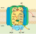
Illustration on PS1, in the style of an existing image
-
Existing image for PS2
- Article(s)
- Photosystem I
- Request
- Please create an illustration for the electron transport chain in PS1 in the style of the existing image. doi:10.1016/B978-0-12-378630-2.00287-5 is my recommended source. It is available via Sci-Hub.
- The change should involve:
- Renumber some parts. D1/D2 become A/B. P680 becomes P700. Fe2+ should be changed to Fx.
- Get rid of B,C,E,F. D1/D2 should be expanded to take the place of B,C.
- Remove PQOR.
- Add two little blobs on the stroma side. They hold Fa and Fb. Fb should connect to another blob for the ferredoxin output.
- Rerouting the bunch of arrows and names to match the source. The input should be a docked blob labeled PC (plastocyanin). It should look symmetrical until it reaches Fx.
- I know it's a lot of work. I actually tried doing it myself, but the size adjustments are hard to do cleanly. Thanks. -- Artoria2e5 🌉 07:49, 29 December 2020 (UTC)
- Discussion
Request COVID-19 Symptoms cleanup

- Article(s)
- Symptoms of COVID-19 and many others as this is transcluded in many major articles
- Request
- See talk page discussion of the article for details. The symptoms and percentages shown are not supported by an appropriate source. Percentages must be removed or substituted with data from appropriate WP:MEDRS source such as [1]. Thanks! -- {{u|Gtoffoletto}} talk 18:51, 12 January 2021 (UTC)
- Discussion
SVG flag
-
SVG coa
-
GIF flag
-
New SVG flag
- Article(s)
- it:Laukiz
- Request
- Is there someone that can gently make svg of the flag using svg of the coa? Many thanks in advance!!! -- 2001:B07:6442:8903:D043:DBDE:8764:3DF2 (talk) 17:21, 13 January 2021 (UTC)
- Discussion
![]() Done --JMKTIN (talk) 19:59, 16 January 2021 (UTC)
Done --JMKTIN (talk) 19:59, 16 January 2021 (UTC)
Pictograms
- Article(s)
- w:pl:Ręce Boga and later translate to Hands of God or something
- Request
- I'm asking just for few pictograms from a vase. Articles about this on all Wikis are bad and English one was even removed, but I have finally good sources and I'm working on this. You can see these pictograms here (image) or here (film from a museum). The pictograms in the image are listed and I need pictograms a (man on horseback), c (woman on horseback), and e (deer). Having b would be nice too, but it is not necessary (it is unfinished or broken) and d exists as File:ReceBogaSwargi.svg. All I need are simple .svg with simple geometry, just like file mentioned before. -- Sławobóg (talk) 19:17, 15 January 2021 (UTC)
- Discussion
Add text to sign diagram
-
Svg base I made
- Article(s)
- Sussex Drive, Confederation Boulevard
- Request
- So I'm looking to make a vectorized street sign for Sussex Drive. The image above I made using the official specifications for the signs, but the text is too difficult to trace and I am unsure of the font used. There is a good example image at File:Elgin St Ottawa Sept 2013.jpg for Elgin Street, and a stock image of Sussex Drive here. Thanks in advance! Also I'm not sure why Wiki is making 512x512px instead of 750x450px -- Floydian τ ¢ 04:21, 17 January 2021 (UTC)
- Discussion
EU Map
-
EU Map
- Article(s)
- List of military and civilian missions of the European Union
- Request
- Please remove the UK from the map as the UK is no longer part of the EU. The C of E God Save the Queen! (talk) 16:57, 17 January 2021 (UTC)
- Discussion
Wanderers 3rd kit
Could someone please create the current Western Sydney Wanderers 3rd kit to put on the club and season page? This is it by the way [2]. WDM10 (talk) 05:51, 18 January 2021 (UTC)


