Wikipedia talk:WikiProject Maps/Archive 1
| This is an archive of past discussions on Wikipedia:WikiProject Maps. Do not edit the contents of this page. If you wish to start a new discussion or revive an old one, please do so on the current talk page. |
| Archive 1 | Archive 2 | Archive 3 | → | Archive 5 |
Map colors
We need to come up with a standard palette of colors to recommend for use in all geographical maps. The previous use of "Pink" (FF0D0) and "Lavender" (F2D0FF) as third and fourth colors for four-color maps is unworkable.
| Color | Hex | Sample | Used for |
|---|---|---|---|
| Black | #000000 | Primary label color | |
| Brown | #A08070 | Political borders. Country, state, and province borders should be brown. | |
| Light brown | #D0C0A0 | Secondary political borders. | |
| Light yellow | #FFFFD0 | Primary territory of interest, or one of four choices for four-color maps. | |
| Pink | #FFD0D0 | Another color to be used for four-color maps. | |
| Orange | #F8A20C | A third color to be used for four-color maps. | |
| Green | #3CE67B | A fourth color to be used for four-color maps. | |
| Light blue | #CEFEF2 | An alternate color to be used for four-color maps. | |
| Orange | #F7D3AA | Alternative color for the above Tan (surrounding territories). | |
| Medium blue | #9EC7F3 | Bodies of water. Oceans or lakes. | |
| Blue | #4090D0 | Water borders, if necessary. For lake or ocean borders that need a color contrasting with surrounding land, or for rivers. | |
| Red | #B00000 | Points of interest. Cities, especially. | |
| Red-orange | #F07568 | Alternative color for the above Red (points of interest). | |
| Medium red | #E0584E | Border color for areas highlighted in Red-orange | |
| Green | #A0F090 | Parks or natural preservation areas |
Feel free to add or revise the colors above and suggest new colors for specific purposes.
- There should probably be a standard set of colors for each type of map that are consistent with each other. For example, for a U.S. county locator map, we should have colors for:
- highlighted county
- county's state
- surrounding land territory
- county borders
- borders in surrounding territory (with different levels of borders probably having different widths)
- water
- county borders on water (optional and if a different water border is necessary)
- other borders on water (also optional)
- optional county's label
- optional state's label
- optional other counties' labels (space permitting)
- optional surrounding territory labels
- optional important points of interest labels (see Image:Ph_locator_albay_legazpi.png which has Mayon Volcano on the map)
- --seav 06:38, Feb 28, 2004 (UTC)
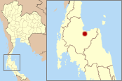
- I have converted my Thailand map to those colors above, and compiled a little city locator map with it. I think the above palette is quite usable. I also have tried to use the same red to highlight a province (but haven't uploaded it yet), and that also looks OK. andy 00:28, 29 Feb 2004 (UTC)
- Looks nice! Though, now that I see it on an actual map, I think maybe the orange color used in seav's maps above may be better than the tan; The same goes for the lighter red-orange used for highlighting. I've added them to the above table as alternatives, so maybe we can vote on favorites at some point. -- Wapcaplet 01:48, 29 Feb 2004 (UTC)
I have added three new colors to the table (pink, lavender and light green), intended for use in four-color maps such as Europe - in which many different territories are of equal interest, but need to be kept separate. They are light, so shouldn't interfere with any other features that need to be shown; they also seem to work well with the same light-brown secondary border color (and the dark brown one, for that matter). -- Wapcaplet 02:45, 7 Mar 2004 (UTC)
-- Pink and Lavender are almost indistinguishable and unworkable on any real map, where the goal is to contrast adjacent territories so one can see the difference between them.

Here's a proof-of-concept using the four-color choices from the table (light yellow, pink, lavender, light green). I've added a new darker blue color for water borders, since I think it helps the shoreline stand out better (especially for small islands like the Florida Keys and Aleutians). I've also removed the tan color from the table, since we seem to agree that it's not as good as the orange. Comments? -- Wapcaplet 17:08, 11 Mar 2004 (UTC)
Well, after I spent a ridiculous amount of time creating that map (actually only a few hours, but still...), I think I may attempt to do some conversion of public-domain PDF maps into SVG format. In particular, I'm hoping to convert a map of national parks in the USA to SVG, and apply our colors to it. Beats loading a gigantic bitmap image and then tracing it; this particular map was produced by the US National Park Service and is public-domain. Anyhow, what I am aiming to assemble is a fairly complete SVG map (or series of maps) of the US that shows boundaries, counties, rivers and lakes, highways, parks, and major city locations, which can then be used to create graphics for corresponding articles. Should be a good stress-test for any colors we choose, too. -- Wapcaplet 22:18, 11 Mar 2004 (UTC)
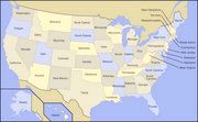
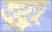
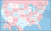
I thought I would show you what Wapcaplet's 4-color map looks like to color-blind people. If you were not thinking about this particular handicap when you were choosing the shades you wanted, you really did a good job of picking acceptible shades. Now if you could add a bit more contrast to the colors, it would just about be perfect, and color-deficient people would be very grateful! Perhaps you could try making the yellow and lavender a little lighter and adding a bit more blue to both the pink and lavender. And the orange for the surrounding territories probably needs to be darker. (The color-blind simulations were created by Vischeck.) -- Bethoc
- I must admit, I didn't consider the issue of colorblindness too much; I was just going for shades as far away from one another on the spectrum as possible. I'm glad they turned out so acceptably, though - Vischeck looks like a great tool; I'll have to use it in the future. Color deficiency is absolutely something we need to think about in choosing our color palette. Additional suggestions on the subject would be welcome! -- Wapcaplet 00:59, 5 Jun 2004 (UTC)
I think these colours could be improved. On this LCD display I cannot distinguish the colours you have named "pink", "lavender" and "orange". I think the low saturation may be the problem. The Times Atlas of the World uses more saturated colours. Gdr 15:18, 2004 Jul 20 (UTC)
Hello! I've been uploading world and other maps for numerous organisations/entities recently. One thought I have -- though this may be neither here nor there -- is to represent a null value (i.e., a country or region that is not a member of this or that) with 25% grey, i.e., corresponding to R,G,B(192,192,192). The current grey is slightly off that. Thoughts? E Pluribus Anthony 00:36, 19 September 2005 (UTC)
Locator Maps
Hi all, I've moved the discussion on locator maps to a subpage. Note that locator maps only show where a place is inside a larger place. Locator maps don't include maps that show all subdivisions of a place (like Wapcaplet's U.S. Maps and Andy's Provinces of Thailand map]])
Map symbols
Does anyone know if there exists an international standard set of map icons or symbols? For example, it's fairly common to see a five-pointed star inside a circle to represent a state capitol. U.S. highway numbers are usually shown with a shield-like icon or state emblem (like these). Airports as a tiny airplane, a blue "H" in a box for hospitals, etc. Anyhow, it'd also be good as part of this map project to have a good set of standard icons. If a standard already exists, we can just use those. -- Wapcaplet 01:06, 17 Mar 2004 (UTC)
Map styles
In addition to color, maps can use a variety of styles such as line widths and styles, fonts, etc. Below are the styles currently under discussion:
| Style | Used for | Comments |
|---|---|---|
| Thick line | Primary borders | Use a thick line for the primary (usually political) borders on a map. If the map primarily depicts a country, use a thick line for the country borders; if a state, the state borders. |
| Thin line | Secondary borders | Use a thin line (approximately 1/2 the thickness of the primary borders) for secondary boundaries. If a state map shows counties, use a thin line for county borders. |
| Italic font | Bodies of water | Use an italicized font for labelling bodies of water: oceans, lakes, rivers, etc. |
| All-caps font | Primary regions | Use a font in all-capital letters for labelling primary regions of interest: country names, state names, etc. |
| Mixed case font | Secondary regions | Use mixed case (capital followed by lowercase) for regions of secondary interest: provinces in a country map, counties in a state map, etc. |
Please feel free to add or revise the styles in the table above.
What about different levels of borders? If, for example, you have a map showing the counties of Texas, How would you show the borders of the Texas counties different from the state boundaries? --seav 20:21, Feb 21, 2004 (UTC)
- I guess that could be distinguished either by color or style (such as line thickness). Primary borders could be thick, secondary ones thin. Tricky to specify what exactly that means, though - a pixel thickness could work, but doesn't really apply to SVG, and would go out the window once an image is resized. Perhaps a relative thickness? Maybe primary borders should be twice as thick as secondary borders.
- Of course there are different kinds of secondary borders; one may want to show county borders in addition to ZIP code or telephone area code regions, or something similar; for those, we'd need additional colors.
- I've made some changes to the tables above to reflect this. -- Wapcaplet 20:53, 21 Feb 2004 (UTC)
Some questions/points
- A lot of the maps I'm making for locations are based on maps which don't have adequate coverage of the surrounding area in order to draw national borders etc.
- I am glad the colours chosen are not quite so horrible as some of the ones I have seen used. I am also glad the sample maps aren't making the mistake of trying to fit in too much details
- No attempt is made at addressing the issue of maps showing the location of each state/whatever all at once. Historically this issue seems to have been ignored. States_of_Brazil is unillustrated, for example.
- The font should be specified.
- Maps should preferably contain the surrounding territories, but a map without the surrounding territories is better than no map at all. As for maps that show all subdivisions of a territory at once, I think we'll eventually talk about these types of maps. Singular locator maps are the first ones to be discussed since they are the most common ones. As for the font, I think consistency of fonts should be a secondary concern to consistency of colors. Myself, I prefer fonts that are narrow (almost all my maps use Officina Sans). --seav 12:04, Mar 9, 2004 (UTC)
My map style is easily replicable by anyone and indeed Snoyes did. Additionally it doesn't really require very good source maps. This is the most important consideration to bear in mind - if we are to have a house style, anyone should be able easily to make maps in it. Morwen 23:14, Mar 6, 2004 (UTC)
- For those subdivision maps I did so far I usually had the opposite problem - I had the all the country outlines, however the subdivision borders where outdated, the changes of the last 5 years weren't available. Maybe we'd need a list of map sources, so we can combine them - as well as for newcomers to this project to be productive as well, without reinventing the wheel first. For me, I usually use the freeware PanMap, which has several vector data for download.
- As I did the Maps of Brazil - the reason why I haven't yet tried to create a map which shows all the states with numbers is simply that the states are very different in size. It is thus a bit difficult to fiddle the number into one of the small coast state; if all states are roughly equal in size it's much easier to do. But maybe you'd notice that even in my pet project Provinces of Thailand, I had to leave out some numbers in the map; I was trying to make a zoom of the dense area but it did not look that much pleasant to me. andy 09:06, 8 Mar 2004 (UTC)
What about dashed lines? Because they do seem to be used where there are lots of different types of border. --Christhebull 16:28, 28 April 2006 (UTC)
Not locator maps
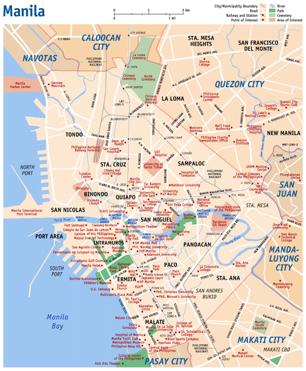
Since this is a Wikiproject on maps in general, and not just locator maps, what about maps that show what's in a territory and not just where the territory is located? I've done two different types of maps for these things:
Province of Cavite, Philippines

The first one shows topographical data as Philippine provinces are large while the second one doesn't show topography since most Philippine cities and municipalities are small.
- These are beautiful maps! I like the color and style choices in these; your water-blue colors in the first map seem closer to what I'd expect to see in an atlas, and I think it may be better to use a brown or subdued orange color (instead of grey) for surrounding territories as you've done. For maps as complex as your Manila map, it'd be pretty hard to recommend colors that would work well in all (or even most) circumstances; it sort of depends on how much stuff is shown at once. We probably also have a lot to think about regarding font face and styles - it helps greatly to have stylistic as well as coloring distinctions on the text. I like the dark red you've used for labeling points of interest, though I think our standard color should be a little bit brighter. It may also be nice to have a standard set of icons to use for points of interest - cities, capitals, parks, airports, buildings, etc. - do you know if there is any international standard for something like this already? It'd be good to stick to established tradition where possible. I think parks should, for obvious reasons, be green :-)
- As for showing highways and other roads - that could quickly become very complicated in itself! Lots of different line/border styles, colors, and thicknesses are possible. I'd have no idea where to begin.
- And now that I think about it, perhaps black is not a great color for showing political boundaries, since black is really the ideal color for most labels, and we don't want them interfering with one another. The reddish color you've used isn't too bad, but maybe something closer to brown would be more in keeping with yellow territory and brown/orange surrounding areas (if we end up using those).
- I've modified the color table above to be a little closer to your maps. At some point we'll have to just start a list of choices and start voting on them... -- Wapcaplet 02:34, 22 Feb 2004 (UTC)
- These maps look way too professional. Suspicious. --Cantus 03:11, Sep 9, 2004 (UTC)
Maps to locate ancient place names
Hello! I have gotten it into my head that it would be a good idea to make maps to show the location of places talked about in historical articles. For example, Diodorus Siculus was from Agyrium, modern Agira, in the province of Enna, Sicily. I'm imagining most people would say "Where is that, exactly?" There are lots of articles that could use a simple map just to fix the location of a few places. What I'd like to do is generate maps that show a selected place (say Agyrion), maybe along with a few more well-known places for reference. I'm thinking of using GMT to draw the maps, but to do that I would need to get the latitude and longitude data for ancient places; I've been trawling the web but haven't found anything yet. So, to wrap up -- (1) is anybody here at WP already working on something like this? and (2) how about print or web references for latitude & longitude data for ancient places? Thanks for any comments you might have, Wile E. Heresiarch 23:38, 24 Apr 2004 (UTC)
- I'm afraid I don't know anything about where to get geospatial data. Nobody's working on it as far as I know; there was discussion a while back about how to use some sort of GIS server to generate maps, but I'm under the impression that such a thing would be a long way off (see m:Wikipediatlas). However, if you have the technical know-how to pull something like that off, you're welcome to give it a shot! At any rate, I think having historical maps would be very cool. I guess we'd have to make them by hand for now, though I can imagine a day when we could, say, look up the year "240 BC" and be able to see world maps as they appeared at that time. -- Wapcaplet 18:20, 27 Apr 2004 (UTC)
- Hi Wapcaplet, thanks for taking the time to respond. I guess I wasn't very clear; I already have coastline data and map-generating software in hand (both from GMT). GMT is pretty flexible, and although it is not particularly aesthetic, I think it can make some simple, useful maps, if I only I had latitude & longitude of ancient places. I think a map server would be cool but for the foreseeable future something that editors run by hand will be very useful. I'll put together an example and post it in the next few days. In the meantime there is an example which makes a map (Cape Cod by default) using GMT -- see [1]. I haven't been able to find a table of latitudes and longitudes that are specifically for places mentioned in ancient history, so I guess I'll just look them up one by one and make a table. I'll let you know if I make any progress. Happy editing, Wile E. Heresiarch 04:52, 29 Apr 2004 (UTC)
- Update: I have been using GMT [2] to draw some locator maps. See: Halicarnassus, Syracuse, Carthage, and Agrigentum. The maps are pretty basic, but I think they serve their function. I have some ideas about how to improve the maps but in the meantime I'd be interested to hear if anybody has some ideas. Regards, Wile E. Heresiarch 06:46, 5 Jul 2004 (UTC)
- Hi Wapcaplet, thanks for taking the time to respond. I guess I wasn't very clear; I already have coastline data and map-generating software in hand (both from GMT). GMT is pretty flexible, and although it is not particularly aesthetic, I think it can make some simple, useful maps, if I only I had latitude & longitude of ancient places. I think a map server would be cool but for the foreseeable future something that editors run by hand will be very useful. I'll put together an example and post it in the next few days. In the meantime there is an example which makes a map (Cape Cod by default) using GMT -- see [1]. I haven't been able to find a table of latitudes and longitudes that are specifically for places mentioned in ancient history, so I guess I'll just look them up one by one and make a table. I'll let you know if I make any progress. Happy editing, Wile E. Heresiarch 04:52, 29 Apr 2004 (UTC)
- I agree, having a map-generator would be great, even if it had to be run by hand for the time being. Ideally, we'd have something at our disposal that allows us to make most of the kinds of maps we want to have, in the colors we choose (discussed above). If not, I suppose some tweaking could be done in graphic software. Anyhow, good luck in your searches. I'll let you know if I run across anything. -- Wapcaplet 08:59, 29 Apr 2004 (UTC)
- Hi Wile E!
- For placenames of the Ancient Mediterranean - European World, see the following:
- For China, see my project, China Historical GIS:
- http://www.fas.harvard.edu/~chgis/
- Also, you may want to look up Matthew Ciolek, who works on Trade Routes.
- http://www.ciolek.com/OWTRAD/gazetteer-00.html
- regards, Lex Berman (http://www.dbr.nu)
Map of a US county showing city boundaries
I got idea that it would be good to illustrate Los Angeles, California with a map which shows the city's borders. Actually, the included map of California with LA highlighted is quite accurate (courtesey of User:Davodd) but it's teensy.
I checked around the Census site and found a promising PDF [3] (Warning, this is a 2.8M PDF file which might choke a slow computer). It shows the cities in Los Angeles County in different pastel colors. If one could strip off the labels and census data to leave only the city maps, it would be easy to use a paint program to color one city bright red. Has anybody done something like this with other counties? I have no experience with GIS, just looking for some information. Mackerm 16:08, 21 Jun 2004 (UTC)
- A follow-up. I did it! Check out the map in the descriptive box at Los Angeles, California. I figured out how to use a freebie GIS program and got some city outlines from the US Census site. I used the exact same colors that a provious wiki-map maker used on the California counties.
- One thing that could be useful: I made the finished map large so that it would have only basic colors; no anti-aliased grays on the boundaries. I did that so other Wiki-editors could easily use a paint program to highlight other cities of they chose, and get good results. I am happy with the auto-resizing feature that shrinks it down to a reasonable size. Note also that while the map size is large, it only takes up a few kilobytes on the servers. Mackerm 06:47, 23 Jul 2004 (UTC)
Village pump discussion
Discussion moved from Village pump at 21:28, 15 Sep 2004 (UTC)
If we go to http://www.getamap.co.uk we can under their licence, we can have a maximum of 10 images of OS maps. I propose that we locate examples of such maps, illustrating at different scales, and upload them.
- Image produced from the Ordnance Survey Get-a-map service. Image reproduced with kind permission of Ordnance Survey and Ordnance Survey of Northern Ireland.
I then propose to add the following:
- Note under this licence, we are limited to a maximum of 10 such images. Please do not upload images without discussion (and pointer to appropriate talk page)
We can do this with an image copyright tag, say {{Copyright_Ordnance_Survey}}
Problems with this are that it is not released under the GFDL, so it falls under "only used with permission". However, given the nature of such images, i.e. we are not going to get permission or alternate, I think this is okay.
We need to try to maximise the potential of the ten, so identifying those which show particular features, e.g. churches, etc, and those of different scales. What do other people think of this? Dunc_Harris|☺ 20:31, 9 Sep 2004 (UTC)
Did someone contact them and see if they would be willing to forgo the limit for this project? You might be suprised. Cavebear42 22:29, 9 Sep 2004 (UTC)
End moved discussion
Projections
A suggestion when you are creating maps, or getting them from PD sources: For some maps, especially world maps, it is important to know what projection method was used to create the map to understand what sort of distortions are inherent in the map. I've added the proper info to Image:World-map-2004-cia-factbook-large-2m.jpg and to the info below the map where I originally found it at Wikipedia:WikiProject Maps/World, but this info is needed for any world map. [[User:GK|gK ¿?]] 11:05, 17 Nov 2004 (UTC)
Colours needed
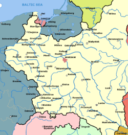
I have a problem with lack of colours for the political entities. I've prepared a map of Poland in 1939 recently, but there is not enough colours in the table above and I'm not entirely happy with my choices. Any advice would be highly appreciated. Also, perhaps we could establish some wikipedia convention on political colours. Most history atlases I know are quite consistent in using the same colour for the same country throughout the ages (for instance England/UK as red, Russia and Soviet Union as pink, France as greyish blue and so on). How about that? [[User:Halibutt|Halibutt]] 01:20, Dec 5, 2004 (UTC)
Source files used to create maps?
(Sorry, I'm not sure what the correct term is for what I'm referring to.)
Should we build a repository of the working files (e.g. PhotoShop, Illustrator, FireWorks, Gimp etc.) used to create maps so that others can update them later and/or reuse them elsewhere?
- some format with various map elements stored in layers where applicable?
Maybe such exists and I've just not found it? I suppose this might also be of use in a larger context within this Wiki (e.g. all images?), but it seems like it would be especially useful here.
- The idea seems great! In the commons there are several GIMP format files with all the layers and thingies. Perhaps we could create a separate gallery of files for use by the map geeks? Commons is the place to go and such a repository of files could be of great help. After all the rivers and shorelines do not change that much and, for instance, my map of Poland anno domini 1660 could be used by someone for creating a map of Central Europe anno domini 2004...
- I'll start such gallery and let you know. [[User:Halibutt|Halibutt]] 09:55, Dec 14, 2004 (UTC)
- While I agree this is a good idea, I would in addition be interested in references to sources of free GIS vector data for making maps. Bitmap style GIMP documents are good for making some maps but are sometimes difficult to resize or zoom for new maps. I put together a brief howto on using GIS data and GIMP for making Wikipedia maps along with two sources of GIS data that I have used. I have only made a few maps so I'm sure some of you will find my techniques primitive. Al guy 03:47, Dec 15, 2004 (UTC)
- Seems like this repository should to be a part/section of a larger repository of source materials used to create graphics (and other media types?) throughout this wiki. Pfwebadmin 19:58, 15 Dec 2004 (UTC)
- Ok, I started the project on commons. (see the box). However, I'm not too sure this would be a good idea since I realised that some of my maps are 8MB+ ... [[User:Halibutt|Halibutt]] 13:43, Dec 16, 2004 (UTC)
- Size of a source repository would definitely have the potential to mushroom. Bandwith/server load prolly wouldn't be too big an issue, though, since these aren't the sort of things that would be downloaded by many people.Pfwebadmin 21:32, 16 Dec 2004 (UTC)
- There's one very important benefit given by source files : the possibility to localize the map in a different language. I think that for every map there should be a version without text or, even better , with editable text (for instance a .sxi with a .png background and text objects shouldn't be that big)._R_ 00:24, 17 Dec 2004 (UTC)
See also Wikipedia:Image source files. We've gotta link that from a more prominent place, since I still have trouble remembering where it is... -- Wapcaplet 19:08, 16 Dec 2004 (UTC)
- Yup, the size is what troubles me since the commons does not accept .zip or .rar, but the bandwidth is indeed not a serious issue. Anyway, I added some GIMP files to the gallery. [[User:Halibutt|Halibutt]] 11:06, Dec 17, 2004 (UTC)
Good call on the commons page. I like the way there are thumbnails for a lot of the files (though it could get pretty bandwidth-intensive with a lot of files there). Yeah, shame about the size limit. If it accepted .zip, it'd be easier to get around that limit. I think the commons is probably a more appropriate place for all our source images. Should we create a broader commons page to encompass the map sources as well as other categories of image? Breaking them into categories might help with finding what you need. I'm sure maps will be one of the biggest categories, but I can foresee needing categories for anatomical diagrams, mechanical illustrations, and a variety of others (plus a 'misc' category for ones that don't fit in an existing category). I haven't used the commons at all; can we do categories there? Nevermind, I see that there are categories :-) -- Wapcaplet 20:51, 17 Dec 2004 (UTC)

